您现在的位置是:网站首页> 编程资料编程资料
纯CSS实现设置半个字符的样式css3中transform属性实现的4种功能详解CSS3.0(Cascading Style Sheet) 层叠级联样式表纯CSS3实现div按照顺序出入效果CSS3实现列表无限滚动/轮播效果css3 利用transform-origin 实现圆点分布在大圆上布局及旋转特效CSS3实现的侧滑菜单CSS3实现的3D隧道效果用CSS3画一个爱心css3 实现文字闪烁效果的三种方式示例代码六种css3实现的边框过渡效果
 2021-09-06
1261人已围观
2021-09-06
1261人已围观
简介 这篇文章主要介绍了纯CSS实现设置半个字符的样式,分别实现了水平和垂直一半、水平和垂直三分之一等效果,需要的朋友可以参考下
在stackoverflow上看到的问题怎么给半个字符设置样式,很多大神给出了答案。我就等就来学习围观吧。
一:基本解决方案:
html:
复制代码
代码如下:X
Y
Z
A
css:
复制代码
代码如下:.halfStyle {
position:relative;
display:inline-block;
font-size:80px; /* or any font size will work */
color: black; /* or transparent, any color */
overflow:hidden;
white-space: pre; /* to preserve the spaces from collapsing */
}
.halfStyle:before {
display:block;
z-index:1;
position:absolute;
top:0;
left:0;
width: 50%;
content: attr(data-content); /* dynamic content for the pseudo element */
overflow:hidden;
color: #f00;
}
效果如图:
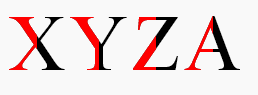
这种方法用于任何动态文本或单个字符,并且都是自动适用的。所有你需要做的就是在目标文本上添加一个class,剩下的就解决了。
同时,保留了原文的可访问性,可以被盲人或视障人士使用的屏幕阅读器识别。
单个字符的实现:
纯CSS。所有你需要做的就是把.halfStyle class用在每个你想要渲染一半样式字符的元素上。
对于每个包含字符的span元素,你可以添加一个data属性,比如data-content=”X”,并且在伪元素上使用content:attr(data-content);这样,.halfStyle:before class将会是动态的,你不需要为每个实例进行硬编码
以下其它效果自行测试了。。。
二:左右开弓,两边都设置样式
更改CSS:
复制代码
代码如下:.halfStyle {
position:relative;
display:inline-block;
font-size:80px; /* or any font size will work */
color: transparent; /* hide the base character */
overflow:hidden;
white-space: pre; /* to preserve the spaces from collapsing */
}
.halfStyle:before { /* creates the left part */
display:block;
z-index:1;
position:absolute;
top:0;
width: 50%;
content: attr(data-content); /* dynamic content for the pseudo element */
overflow:hidden;
pointer-events: none; /* so the base char is selectable by mouse */
color: #f00; /* for demo purposes */
text-shadow: 2px -2px 0px #af0; /* for demo purposes */
}
.halfStyle:after { /* creates the right part */
display:block;
direction: rtl; /* very important, will make the width to start from right */
position:absolute;
z-index:2;
top:0;
left:50%;
width: 50%;
content: attr(data-content); /* dynamic content for the pseudo element */
overflow:hidden;
pointer-events: none; /* so the base char is selectable by mouse */
color: #000; /* for demo purposes */
text-shadow: 2px 2px 0px #0af; /* for demo purposes */
}
三:设置水平一半的样式
CSS:
复制代码
代码如下:.halfStyle {
position:relative;
display:inline-block;
font-size:80px; /* or any font size will work */
color: transparent; /* hide the base character */
overflow:hidden;
white-space: pre; /* to preserve the spaces from collapsing */
}
.halfStyle:before { /* creates the top part */
display:block;
z-index:2;
position:absolute;
top:0;
height: 50%;
content: attr(data-content); /* dynamic content for the pseudo element */
overflow:hidden;
pointer-events: none; /* so the base char is selectable by mouse */
color: #f00; /* for demo purposes */
text-shadow: 2px -2px 0px #af0; /* for demo purposes */
}
.halfStyle:after { /* creates the bottom part */
display:block;
position:absolute;
z-index:1;
top:0;
height: 100%;
content: attr(data-content); /* dynamic content for the pseudo element */
overflow:hidden;
pointer-events: none; /* so the base char is selectable by mouse */
color: #000; /* for demo purposes */
text-shadow: 2px 2px 0px #0af; /* for demo purposes */
}
四:水平三分之一的样式
css:
复制代码
代码如下:.halfStyle { /* base char and also the bottom 1/3 */
position:relative;
display:inline-block;
font-size:80px; /* or any font size will work */
color: transparent;
overflow:hidden;
white-space: pre; /* to preserve the spaces from collapsing */
color: #f0f;
text-shadow: 2px 2px 0px #0af; /* for demo purposes */
}
.halfStyle:before { /* creates the top 1/3 */
display:block;
z-index:2;
position:absolute;
top:0;
height: 33.33%;
content: attr(data-content); /* dynamic content for the pseudo element */
overflow:hidden;
pointer-events: none; /* so the base char is selectable by mouse */
color: #f00; /* for demo purposes */
text-shadow: 2px -2px 0px #fa0; /* for demo purposes */
}
.halfStyle:after { /* creates the middle 1/3 */
display:block;
position:absolute;
z-index:1;
top:0;
height: 66.66%;
content: attr(data-content); /* dynamic content for the pseudo element */
overflow:hidden;
pointer-events: none; /* so the base char is selectable by mouse */
color: #000; /* for demo purposes */
text-shadow: 2px 2px 0px #af0; /* for demo purposes */
}
五:垂直三分之的样式
css:
复制代码
代码如下:.halfStyle { /* base char and also the right 1/3 */
position:relative;
display:inline-block;
font-size:80px; /* or any font size will work */
color: transparent; /* hide the base character */
overflow:hidden;
white-space: pre; /* to preserve the spaces from collapsing */
color: #f0f; /* for demo purposes */
text-shadow: 2px 2px 0px #0af; /* for demo purposes */
}
.halfStyle:before { /* creates the left 1/3 */
display:block;
z-index:2;
position:absolute;
top:0;
width: 33.33%;
content: attr(data-content); /* dynamic content for the pseudo element */
overflow:hidden;
pointer-events: none; /* so the base char is selectable by mouse */
color: #f00; /* for demo purposes */
text-shadow: 2px -2px 0px #af0; /* for demo purposes */
}
.halfStyle:after { /* creates the middle 1/3 */
display:block;
z-index:1;
position:absolute;
top:0;
width: 66.66%;
content: attr(data-content); /* dynamic content for the pseudo element */
overflow:hidden;
pointer-events: none; /* so the base char is selectable by mouse */
color: #000; /* for demo purposes */
text-shadow: 2px 2px 0px #af0; /* for demo purposes */
}
相关内容
- css3使网页、图片变成灰色兼容大多数浏览器css3中transform属性实现的4种功能详解CSS3.0(Cascading Style Sheet) 层叠级联样式表纯CSS3实现div按照顺序出入效果CSS3实现列表无限滚动/轮播效果css3 利用transform-origin 实现圆点分布在大圆上布局及旋转特效CSS3实现的侧滑菜单CSS3实现的3D隧道效果用CSS3画一个爱心css3 实现文字闪烁效果的三种方式示例代码六种css3实现的边框过渡效果
- ie placeholder属性的兼容性问题解决方法HTML5 placeholder属性详解让IE下支持Html5的placeholder属性的插件HTML 5 input placeholder 属性如何完美兼任ieHTML5 placeholder(空白提示)属性介绍限制html文本框input只能输入数字和小数点使一个input文本框随其中内容而变化长度的方法使用placeholder属性设置input文本框的提示信息
- a标签的css样式四个状态LVHA的设计CSS Transition通过改变Height实现展开收起元素从QQtabBar看css命名规范BEM的详细介绍css实现两栏布局,左侧固定宽,右侧自适应的多种方法CSS 实现Chrome标签栏的技巧CSS实现两列布局的N种方法CSS实现隐藏搜索框功能(动画正反向序列)CSS3中Animation实现简单的手指点击动画的示例详解CSS中的特指度和层叠问题详解overflow:hidden的作用(溢出隐藏、清除浮动、解决外边距塌陷)关于CSS浮动与取消浮动的问题
- div style属性中设置其border无效是什么情况如何解决设置div背景透明的方法示例CSS实现div不设高度完全居中div自适应高度自动填充剩余高度详解DIV+CSS的命名规矩才能有利于SEO优化的实现方法DIV或者DIV里面的图片水平与垂直居中的方法详解如何用div实现自制滚动条div对齐与网页布局详解DIV+CSS实现电台列表设计的示例代码div+css实现带箭头的面包屑导航栏不定宽高的文字在div中垂直居中实现方法
- CSS中文字体对应的英文写法(常用整理)CSS字体中英文名称对照表 CSS常用中文字体英文名称对照表css中默认中文字体font-family列表中文字体在CSS中的写法整理CSS font-family为英文和中文字体分别设置不同的字体css中 中文字体相关知识汇总
- 用margin解决缩进问题CSS Transition通过改变Height实现展开收起元素从QQtabBar看css命名规范BEM的详细介绍css实现两栏布局,左侧固定宽,右侧自适应的多种方法CSS 实现Chrome标签栏的技巧CSS实现两列布局的N种方法CSS实现隐藏搜索框功能(动画正反向序列)CSS3中Animation实现简单的手指点击动画的示例详解CSS中的特指度和层叠问题详解overflow:hidden的作用(溢出隐藏、清除浮动、解决外边距塌陷)关于CSS浮动与取消浮动的问题
- 利用margin实现等高布局CSS Transition通过改变Height实现展开收起元素从QQtabBar看css命名规范BEM的详细介绍css实现两栏布局,左侧固定宽,右侧自适应的多种方法CSS 实现Chrome标签栏的技巧CSS实现两列布局的N种方法CSS实现隐藏搜索框功能(动画正反向序列)CSS3中Animation实现简单的手指点击动画的示例详解CSS中的特指度和层叠问题详解overflow:hidden的作用(溢出隐藏、清除浮动、解决外边距塌陷)关于CSS浮动与取消浮动的问题
- CSS隐藏文字的6种方法CSS隐藏网页文字的几种常用方法-CSS教程-网页制作-网页教学网
- 仅用CSS让你的div模块旋转
- CSS控制二级菜单动态出现不只有js才能做到CSS Transition通过改变Height实现展开收起元素从QQtabBar看css命名规范BEM的详细介绍css实现两栏布局,左侧固定宽,右侧自适应的多种方法CSS 实现Chrome标签栏的技巧CSS实现两列布局的N种方法CSS实现隐藏搜索框功能(动画正反向序列)CSS3中Animation实现简单的手指点击动画的示例详解CSS中的特指度和层叠问题详解overflow:hidden的作用(溢出隐藏、清除浮动、解决外边距塌陷)关于CSS浮动与取消浮动的问题


